
In 1975 Steve Stasson, an engineer at Kodak invented the digital camera.
Back then Kodak was the market leader in film photography. When he showed the prototype to management they said, “That’s cute- but don’t tell anyone about it.”
Cute??
That “Kodak moment” was the first in the long list of strategic and tactical missteps which felled Kodak from its perch and made it file for bankruptcy protection in 2012.
Today, no matter what kind of business you are in you can’t afford to say cute to mobile and ignore it. Building websites that look good on any device is no longer a luxury but is as essential as having a website. For, check out some stats around how people are using mobile:
- US users spend 60% of their time online on mobile devices.
- 70% of searches on mobile lead to user action within an hour.
- 40 % people will choose a different site if the first does not look good on mobile.
These statistics indicate that you have to focus on providing a great user experience for your users to stay in the game.
The right approach to designing a mobile friendly website
The easiest way to find out whether your website is optimized for mobile is by running it through Google’s Mobile Friendly test. If everything is all right you will see something like this:
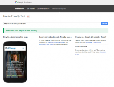
If there is a problem the tool will show red and specify some of the more serious issues that can be fixed immediately.
Building a responsive website or an adaptive website- basically one that looks good on all devices is complicated considering the hardware and platform fragmentation of the mobile ecosystem.
So before you start designing and building start with these questions. You will be doing yourself and your readers a huge favor.
- How wide will the site be?
How many columns should the website be on different devices? On a big screen your website might have 3 columns, but that will not work for a tiny cell phone screen. Determine the transition of structure from one device to another so that the user experience is seamless.
- Will it shrink?
Let’s assume that your normal site has a number of elements sitting next to each other. When it is viewed on a smartphone, will these elements shrink in size and basically be a miniature version of the site on desktop, or will they adjust so that the elements are sitting on top of each other, making for a long scrolling mobile site?
- What is the most important element?
Every website has a priority element. For a site selling pizzas it’s the phone number. For a SaaS website it’s the call to action for a free trial. You want that priority element to be very noticeable so that users can immediately perform the right action without wasting time and figuring out how your site works.
- How should images look like?
On a bigger screen you can show multiple images, but on a smartphone you have to pick one or two images which are absolutely critical for conversion. You also need to think about how much percentage of screen real estate they would take up on various devices, and whether they will shrink or expand with screen size.
- What should the text say?
A single line on the desktop can look like a wall of text on mobile. That’s an instant turn off. Furthermore, the text on mobile cannot beat around the bush- your reader might be jostled about in a crowded bus while she is reading it. When you are writing the content for your responsive site, think about all the different situations your reader might be in, and plan accordingly.
- How should the navigation work?
Easy navigation is one of the hallmarks of a well designed mobile site. Your desktop navigation with fancy mouse over actions will not work on a touch screen. For better user experience you might also want to simplify the navigation and determine whether the site on different mobile devices should have the same orientation and look as the desktop site.
Conclusion
A website that looks good across multiple devices will take more time, effort and money to build than a website which is designed for just one device. But with Google rewarding sites that are optimized for mobile in search engine rankings, and with mobile traffic outstripping desktop traffic investing in responsive design will see more traffic and higher conversion rates.


